Abortion Deserts
Abortion Deserts by Queenie Wu and Levi Villarreal - 2025
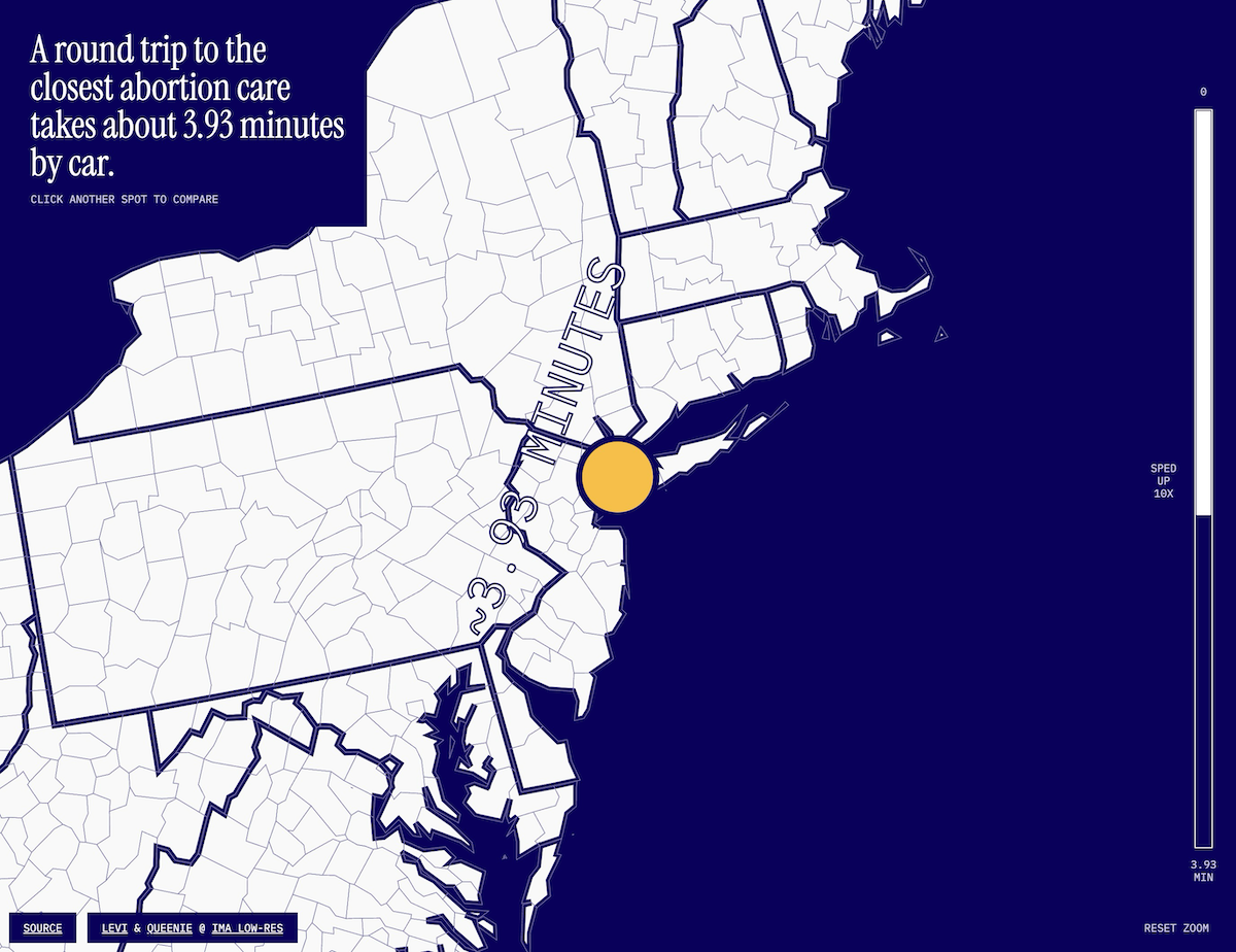
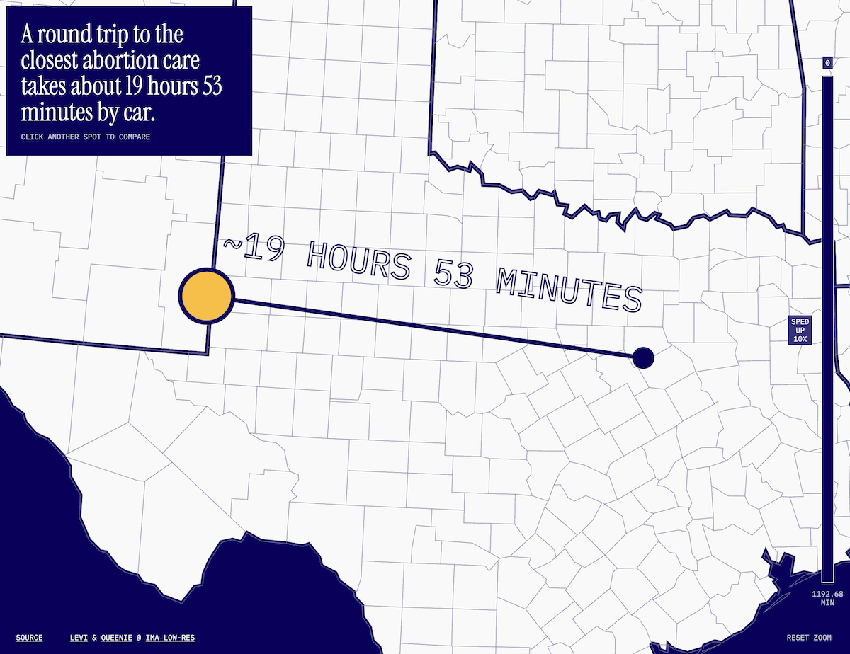
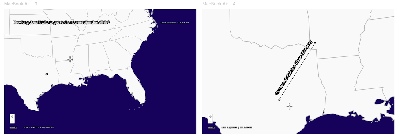
The first screenshot is where I grew up in Texas (20 hours round trip). The second is my current home in New York City (4 minutes).
I still remember where I was when I heard Roe v Wade was overturned. I remember the dread I felt as I realized the implications, and how worried I was for the women in my life. But selfishly, one of my first thoughts was: “well, at least I don’t live in Texas anymore.” This project was born because of feeling - and sat in my backlog of project ideas until this year.
Ideation
When we got the prompt of ‘time’ for our creative coding class this summer, this idea of an abortion desert map surfaced while brainstorming with Queenie. As a creative cartographer, she had ample experience creating maps, and thanks to another mapping project PutItInPark, I had a scaffolding set up for an interactive United States Map. This made this project possible on such a short timeline (1 week).
Data sourcing
As one can imagine, the precise location of every abortion clinics in the country is data that could be easily abused by those seeking to further restrict abortion access, or target those who provide or use their services. Thus, it was hard to find a dataset for our purposes. What I did find was the Abortion Facility Database by UCSF “contains information on over 900 abortion facilities in the United States. The data for the Facility Database has been generated from online research from publicly available sources and mystery phone calls.” This data is provided to researchers and journalists after a lengthy application and thorough vetting (again, appropriate given the data).
However, they did have a publicly available interactive map, which showed “brick-and-mortar abortion clinics in the United States by zip code.” Zip code granularity was fine for our purposes, since our tool was meant to be exploratory in nature rather than a practical tool for finding an abortion clinic. Since the map was an embedded arcgis file, I was able to reverse engineer the points of the map.
-
I used inspect element to get a direct link to the embedded map
-
You can get the underlying data in a json format by tweaking the url parameters
-
The data is in a format like this
"type": "FeatureCollection", "features": [ { "type": "Feature", "id": 1, "geometry": { "type": "Point", "coordinates": [ -117.28382000009, 34.0921500003526 ] }, "properties": { "Zipcode2023": 92408, "FID": 1 } }, ... -
The data didn’t really need to be cleaned up after this! It was good to go for our map
Plotting this data with d3, we had a map nearly identical to the one on the UCSF website.
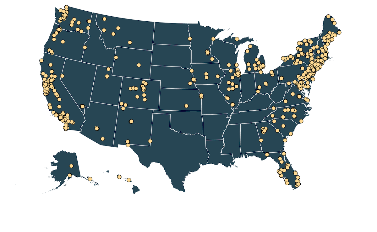
Map showing all abortion care facilities in the US
Design
Queenie took point on design for this project. The guiding questions we had were:
- What do we want people to take away from this map?
- Is it a tool? A helping hand? Is it educational?
We aren’t the first ones to think of a representation like this, many other, static, ‘heat map’ style infographics existed on this topic, so could we add by making it interactive?
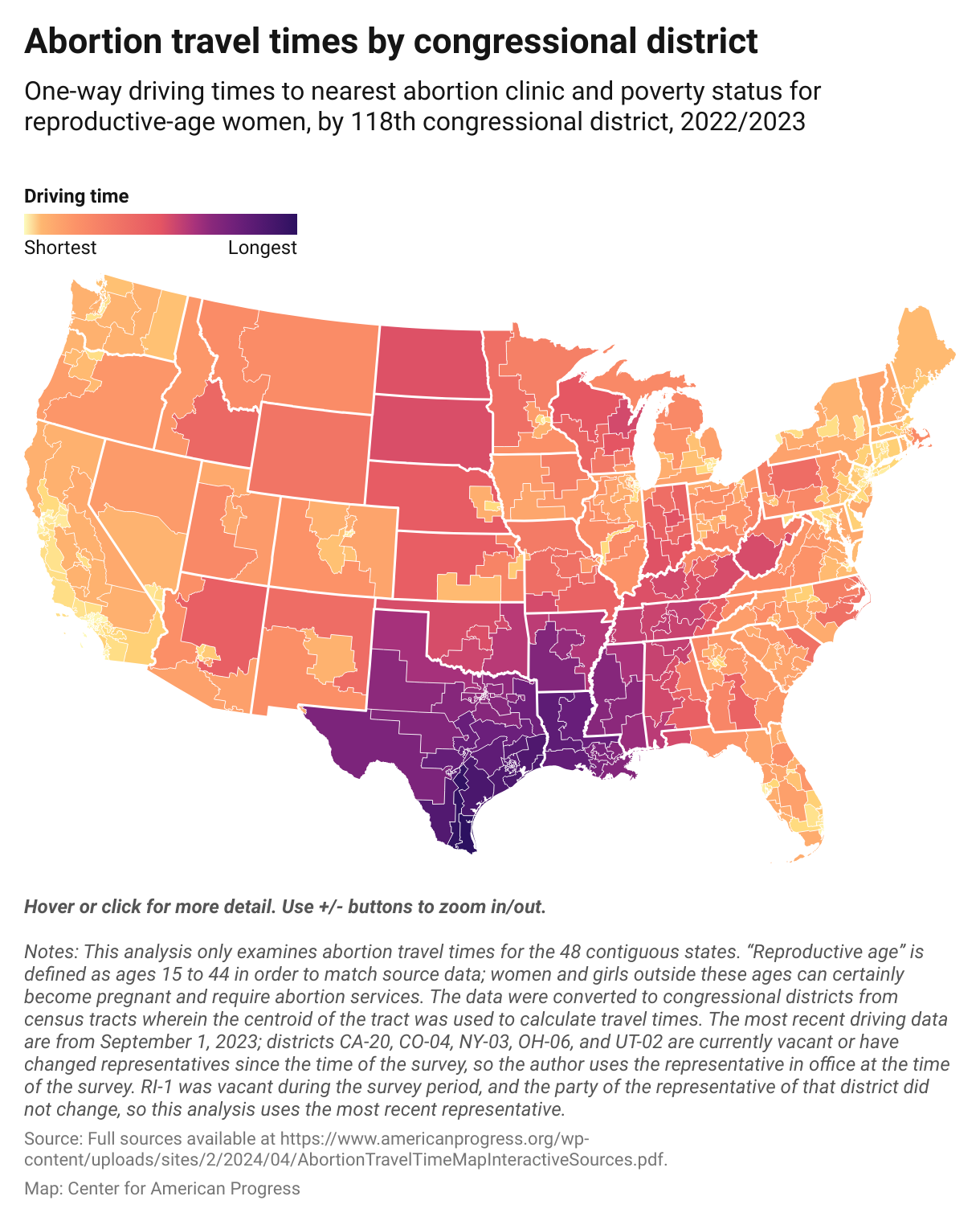
Map from the Center for American Progress of Abortion times by congressional district
What we landed on was while we didn’t want this to be a practical tool to drive to a clinic (and due to data constraints, we couldn’t make that) we wanted to make this data feel personal. We wanted to contextualize the distance to an abortion clinic in a way people could relate to: round trip drive time. We also wanted a way for people to be able to easily and directly compare the inequality of abortion access. Queenie designed a point and click interaction that would inform the user the drive time to the nearest clinic. I added a timer (sped up by 10x) to give the user a weightier sense of time beyond just text.
Queenie’s initial Figma designs
Development
I used Svelte as the web framework for this project, and (mentioned earlier) d3 for the data visualization and d3-geo for a map projection and distance calculations. From a previous project I found a json map of the United States with state and county lines, which we show only if the user is sufficiently zoomed in.
The relevant code for plotting the states and counties is as follows
import us from '$lib/us.json';
import { feature } from 'topojson-client';

const states = feature(us, us.objects.states).features;
const counties = feature(us, us.objects.counties).features;

// Set up the svg container
const chart = d3
  .select(chartElement)
  .append('svg')
  ... // Add sizing, fill etc

// Plot all of the states
statesGroup = chart.append('g');
statesGroup
  .selectAll('path')
  .data(states)
  .enter()
  .append('path')
  .attr('class', 'states')
  .attr('d', path);

// Plot all of the counties
const countiesGroup = chart.append('g')
countiesGroup
  .selectAll('path')
  .data(counties)
  .enter()
  .append('path')
  .attr('d', path)
  .attr('fill', 'none')
  ... // Add other properties
We implemented panning and zooming ourselves, which was way easier than expected.
// Panning and zooming functionality
const zoom = d3
  .zoom()
  .on('zoom', function (event) {
    g.attr('transform', event.transform);
  })
  .on('start', function () {
    d3.select(this).classed('dragging', true);
  })
  .on('end', function () {
    d3.select(this).classed('dragging', false);
  };
When the user clicks on the map, we run a function that loops through all of the clinics and finds the shortest distance. We make a (very naïve assumption) that 1km of distance will equal roughly 1 minute of travel time, and multiply that by 2 to get the round trip time.
function findShortestDistance(
		clinicPoints: [number, number][],
		clickedCoordinates: [number, number] | null
	): { closestClinic: [number, number] | null; minDistance: number } {
  // for length of array use d3.distance to calculate distance between click and a point. if it's shorter than min, replace value
  let minDistance = Infinity;
  let closestClinic: [number, number] | null = null;

  if (!clickedCoordinates) {
    return { closestClinic: null, minDistance: Infinity };
  }

  for (const point of clinicPoints) {
    const radians = geoDistance(point, clickedCoordinates);
    const distanceKm = radians * 6371 * 2; // times by earth's radius in km, double for round trip

    if (distanceKm < minDistance) {
      minDistance = Math.floor(distanceKm * 100) / 100;
      closestClinic = point;
    }
  }
  return { closestClinic, minDistance };
}
Reflection
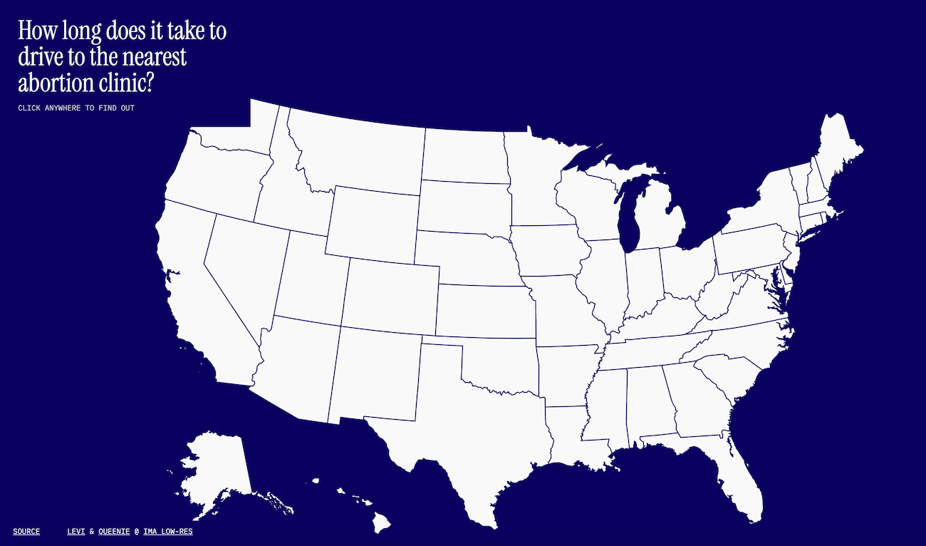
Final project landing page
Technically, this project was not very complex, but there was a lot of moving pieces to get working together within just a few days. I think starting with a strong design and project vision really guided this project towards completion, and made a huge difference on the audience impact. Some other points of reflection I had based on teacher and student feedback was:
- People saw immediately how powerful this tool could be as an educational tool.
- Some were confused by the exploratory nature, and wanted a version with names and addresses for practical use.
- Some wanted more information. County names, state abortion laws, etc.
- Most were confused by the timer on the right, and it seemed like it had little utility. I would consider removing it entirely.
The main thing I learned from this project was that I really enjoyed working with another person for creative coding projects, and it made the work much stronger and more impactful!